Client
OMI WellBeauty
Industry
Beauty and Wellness Supplements
Platform
Shopify Plus
Partner
Valar Ecom (CRO & Shopify Experts)

OMI WellBeauty is a DTC subscription brand selling beauty-from-within supplements. Its flagship supplement comes in two formats: Hair Growth Peptide Capsules & Gummies, and the homepage hero asked visitors to pick one using two separate buttons, each opening its own page. Visitors were choosing a product before they had decided to buy, and every click cost a full page load.
We tested one variant against the existing homepage. A single outcome-led call to action replaced the two product buttons, the offer opened on the homepage instead of a new page, and the headline led with a clinically backed result. The format choice moved to the buy box, and the test ran as a controlled A/B test with no changes to campaigns, pricing, or the rest of the site.
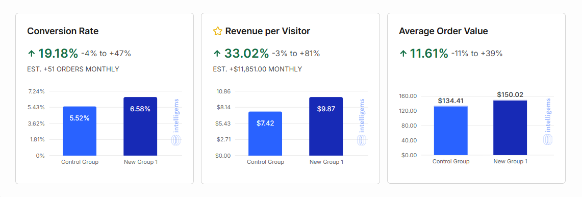
Removing one early decision lifted revenue per visitor, conversion rate, and average order value. Returning visitors responded most, converting at more than twice their previous rate.
Revenue per visitor
Increased from $7.42 to $9.87
Conversion rate
Increased from 5.52% to 6.58%
Average order value
Increased from $134.41 to $150.02
Estimated monthly revenue lift
$11,851 per month
We ran an A/B test on the homepage of a DTC subscription brand, OMI WellBeauty, to answer one specific question: Does removing a decision from the top of the funnel actually help people buy?
The original homepage asked visitors to choose between two products right when they landed, before they’d even decided to buy anything. That kind of friction isn’t a KPI metric, so understanding the customer flow was essential to shaping the right strategy.
After executing the plan, OMI’s conversion rate rose 19.18%, revenue per visitor rose 33.02%, and people who trusted the brand converted at more than 2x their previous rate.
OMI sells a flagship supplement in two different formats and lets customers choose whichever type of product they like, based on their taste and preferences. On the original homepage, the hero section asked visitors to choose between the two formats with two separate buttons, each routing to its own page.
At first, this doesn’t look like friction. In fact, it feels like we’re serving what customers want. But the purchase flow was broken. The site was actually forcing visitors to choose between two products even before making a purchase decision.
Then, whichever button they clicked, they were sent to a separate page for the product in a different format accordingly. That’s a full page load right after the homepage has built the most momentum.
It's a pattern we see consistently across e-commerce brands, and it's one that never shows up cleanly in analytics.
Simply put, the homepage was doing all the hard work and handing visitors away before establishing clear purchase intent.
Rather than testing the button and the page flow as two separate experiments, we shipped both changes together as a single variant against the existing homepage. Here’s how:
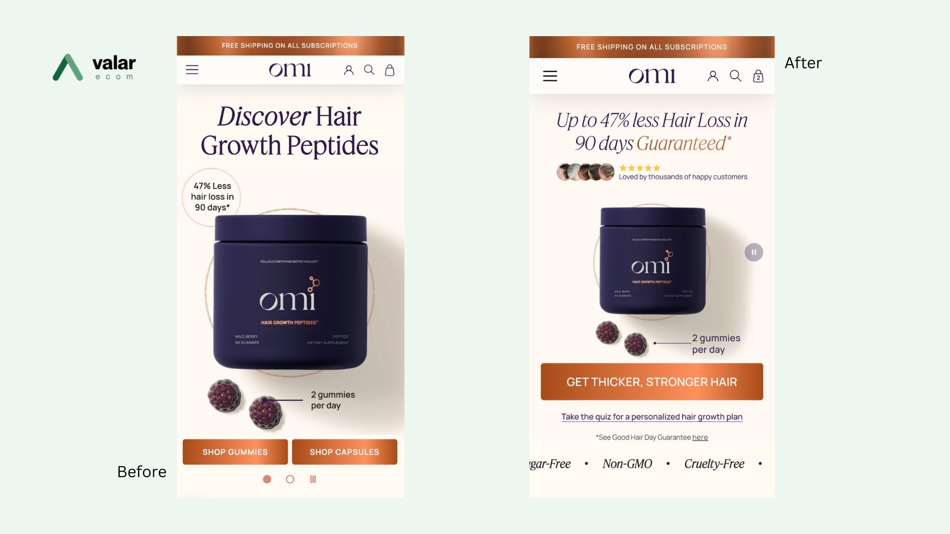
We replaced the two competing buttons with a single call to action tied to the customer’s goal, not a product spec they don’t know anything about yet. Instead of asking which product they want, we asked them to commit to the results they were already there for. That’s a decision visitors are actually ready to make on their very first scroll.
Instead of sending visitors off to a separate page, the new call to action kept them right where they were, moving the offer to them instead of asking them to go find it. No second decision, no extra page load, just a continuous path from interest to purchase.
We sharpened the hero copy to lead with concrete, clinically backed results, giving visitors a reason to trust the outcome before they ever reach the offer.
This has removed all three blockers, namely a choice, a click, and a reason to hesitate in their purchase journey.
30 minutes, your store, clear next steps.
Measured across the test period, the new homepage outperformed the original on every metric we tracked.
| Metric | Lift |
|---|---|
| Conversion Rate | +19.18% |
| Revenue Per Visitor | +33.02% |
| Average Order Value | +11.61% |
| Subscriber Renewal Orders | +107% |
| Returning Visitor Revenue Per Visitor | +129.77% |
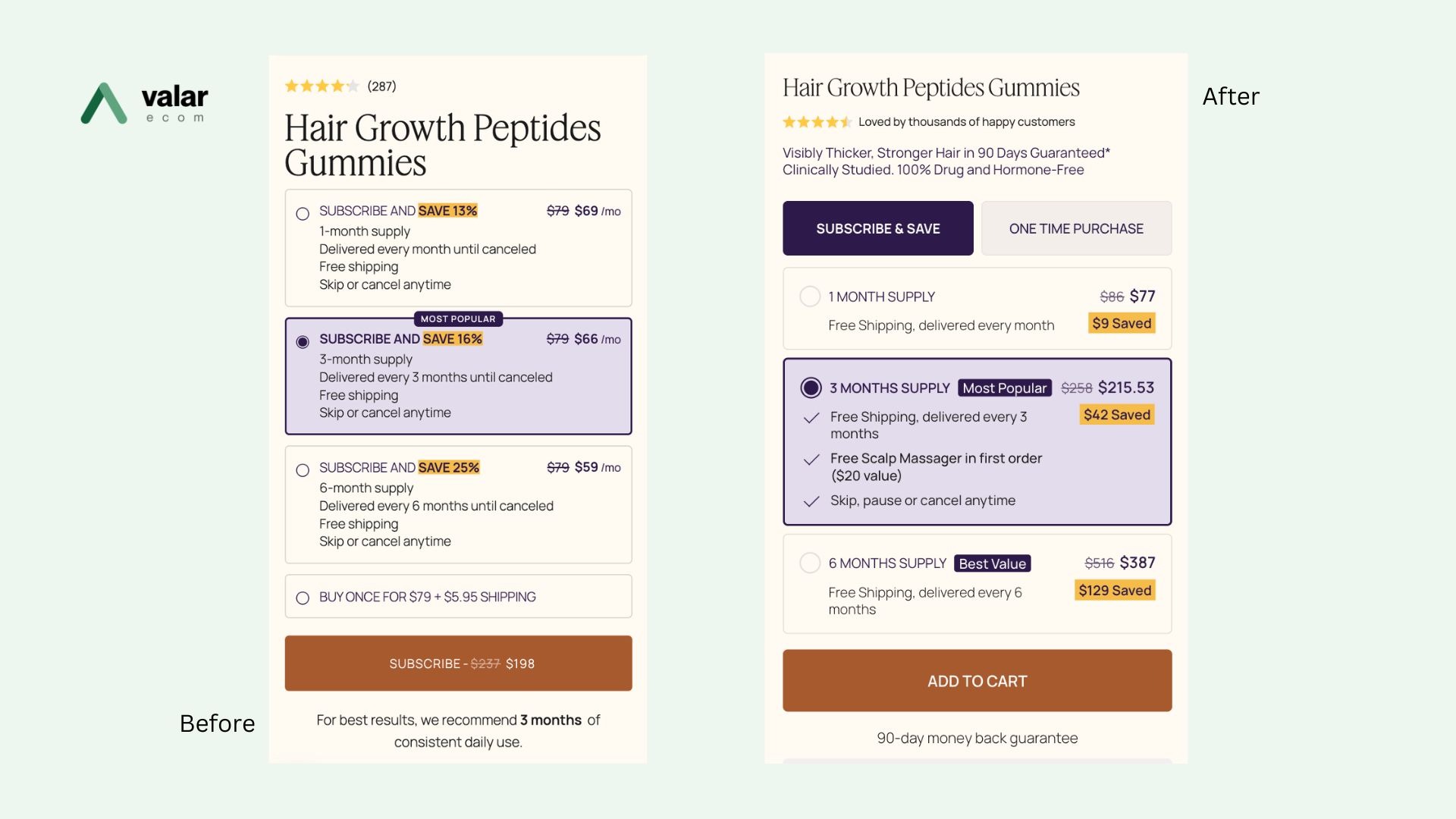
The results point exactly where friction costs a brand the most. It’s not hidden deep in checkout, but at the very first decision a visitor is asked to make. Removing the product decision from the homepage didn’t just simplify the page, but also let visitors choose between their desired products right after they begin to trust the product, so we kept that choice when they reach the buy box.
The clearest signal is in the returning visitor numbers. Subscriber renewal orders jumped +107%, and revenue per returning visitor rose +129.77%, telling us the old flow was holding back exactly the visitors most inclined to buy: people who already trusted the brand and just needed a clear path to check out.
Once that friction was removed, they converted at dramatically higher rates.
If your homepage is asking visitors to make product decisions before they’ve decided to buy, you’re likely adding friction at the exact point the momentum is built.
Book a free 30-minute session with our Shopify and CRO specialists. Bring your questions, and we'll bring the plan.
Choose a slot that suits you and tell us a little about your store.
A focused 30-minute video call on your goals, your funnel and what's in the way.
Clear, prioritised next steps, yours to keep whether or not we work together.
Book a 30-minute session with the Valar Ecom team and leave with a clear plan to grow.
