Back to Blogs
Shopify CRO Guide: How DTC Brands Boost Conversions
Conversion Rate Optimization (CRO) is about turning more visitors into customers. For Shopify stores, that simply means generating more purchases. Since most Shopify stores convert less than 2% of their visitors, many DTC brands struggle to implement the right strategies that actually improve conversions.
While most of the “CRO advice” out there doesn’t help much, since it often suggests adding reviews, changing button colors, or writing better copy. Their advice isn’t exactly wrong; it just doesn’t tell you where exactly to look to identify the problem. It ignores the way Shopify actually works through locked-down checkout flows, theme code that quietly slows down pages, and apps that stack scripts on top of each other.
Every optimization in this guide is designed to increase that percentage. We'll focus on the changes that actually improve conversions for DTC Shopify brands and ignore the ones that barely make a difference.
What is a Good Conversion Rate for Shopify Stores?
The average Shopify store converts somewhere around 1.4-1.6%. Anything above 2.5-3% is solid since these are the top 20% performers.
But “good” depends heavily on what you sell. A food and beverage brand and a luxury furniture brand are playing completely different games. Cheaper, more habitual purchases convert at much higher rates than expensive, considered ones.
Here’s a breakdown:
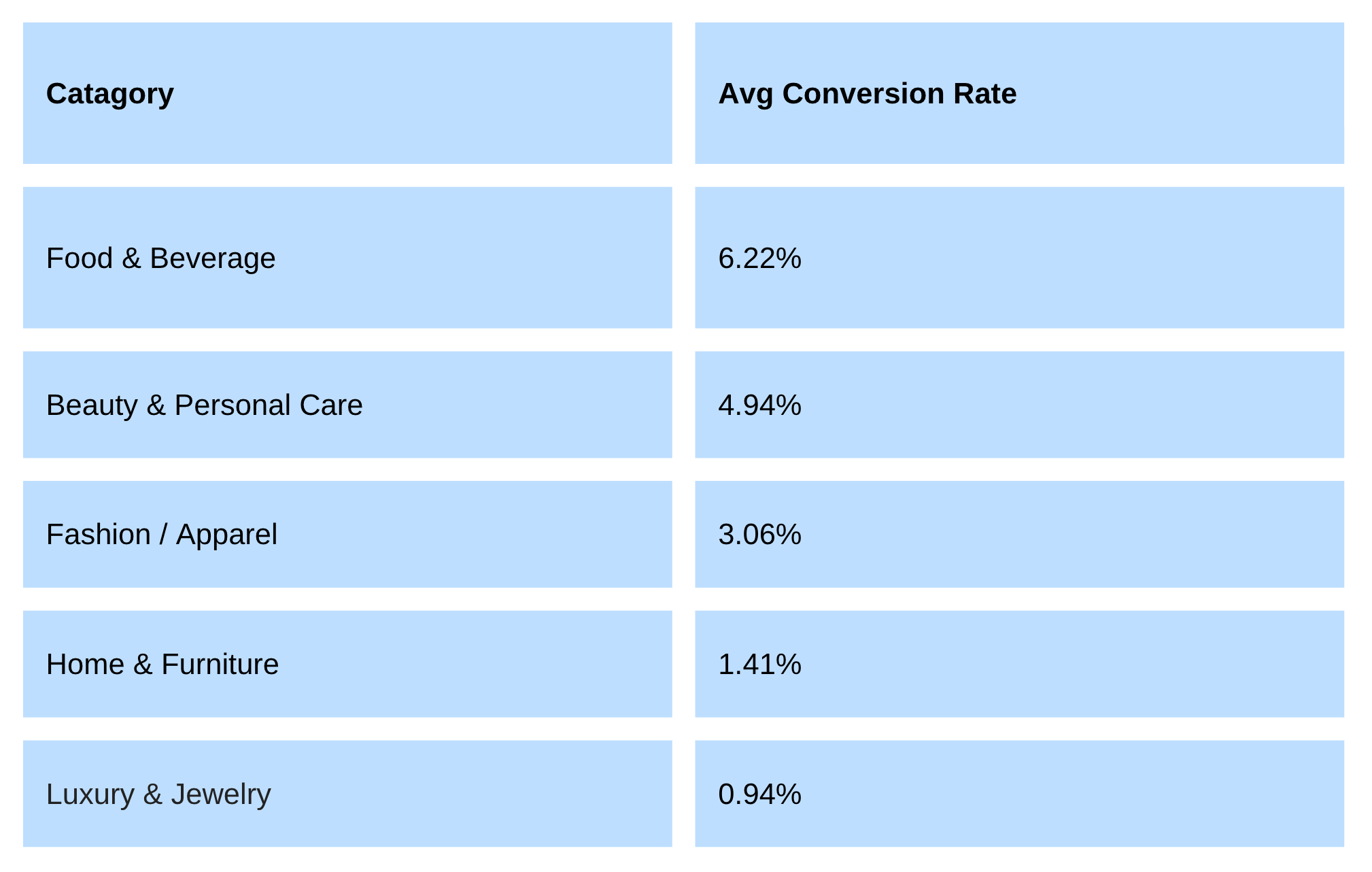 You can use these numbers as a compass and not a finish line. A home goods store sitting at 1.4% might already be doing well for its category, while a fashion brand at the same rate has real room to grow. The most useful benchmark isn’t this industry average, but your own store’s last month.
A brand moving from 1.0% to 1.5% is improving faster than one crawling from 3% to 3.2%, even though the second number looks more impressive on paper.
How to check your Shopify conversion rate?
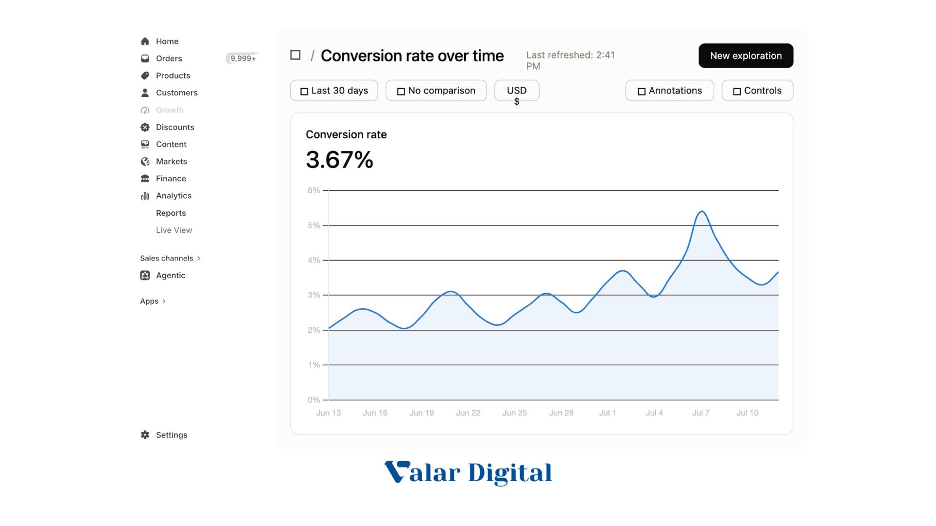
You don’t need extra tools to find this number:
- In Shopify Admin, go to Analytics (on the left side menu) → Reports.
- Look under the Behavior category for Conversion Rate Over Time.
This report will show what percentage of sessions ended in a purchase over any date range you pick. The Conversion Rate Breakdown report goes a step further and shows where people drop off step by step.
We suggest connecting Google Analytics 4 (GA4) to get a second, more detailed view of the funnel, especially to track your particular A/B test performance.
But here’s the catch. Almost every DTC brand checks these numbers, but very few actually dig into why they're performing the way they are. Knowing your site converts at 1.5% tells you almost nothing on its own. The real work starts when you compare it and break that number down by device, traffic source, and funnel steps. That's exactly where you'll get to know where your customers are dropping off, and it's the foundation for everything covered in the rest of this guide.
Why do Most Shopify Stores Convert Below Average?
A handful of problems show up again and again in underperforming stores:
- Slow page loads: Shoppers today have almost no patience for a lag. If your pages are slow, you’re losing people before any other part of your funnel even gets a chance to work.
- A generic, uncustomized theme: Free or outdated themes often carry bloated/heavy code that wasn’t built to target your purchase intent.
- Checkout friction: Extra steps, surprise fees, and forced account creation all push people to abandon at the last moment.
- No post-purchase strategy: Most stores treat the “Thank You” page as the end of the relationship instead of the start of the next sale.
- Decisions made on gut feelings: Guessing which button color or headline “feels right” rarely produces lasting gains and catches the right intent, as it takes away any potential lift.
If your store is converting below its category average despite decent traffic, these five areas are the first you must check before getting into other metrics. Let’s explore each one briefly:
Shopify Conversion Rate Optimization: The Foundations
Before testing anything fancy, get these five fundamentals right. They’re the foundations on which everything else is built:
1. Fix page speed first
Speed is the single biggest lever in CRO, since a slow page kills the sale before a shopper even sees your offer. The relationship between load time and conversion is steep and well-documented. Pages that load in one second convert roughly three times better than pages that take five seconds. Even a fraction of a second of improvement can produce measurable life in sales.
Three things to do about it on Shopify specifically:
- Compress every image before you upload it: Use tools like TinyPNG or convert to WebP. Large, uncompressed product photos are one of the most common causes of slow PDPs.
- Audit your installed apps and remove the ones you don’t need: Most Shopify apps inject their own scripts on every page, whether they’re active or not. Fewer apps generally means a faster storefront.
- Check your speed score weekly: Use Google’s free PageSpeed Insights to check your store’s loading performance. If the score drops after you make the change, you’ll catch it right away instead of losing weeks of traffic to it.
Treat speed as priority zero. Nothing else on this list matters if visitors leave before the page finishes loading.
2. Simplify checkout
Checkout is where intent actually turns into revenue. It’s also where most of otherwise-interested shoppers quietly leave. A few fixes will make an outsized difference:
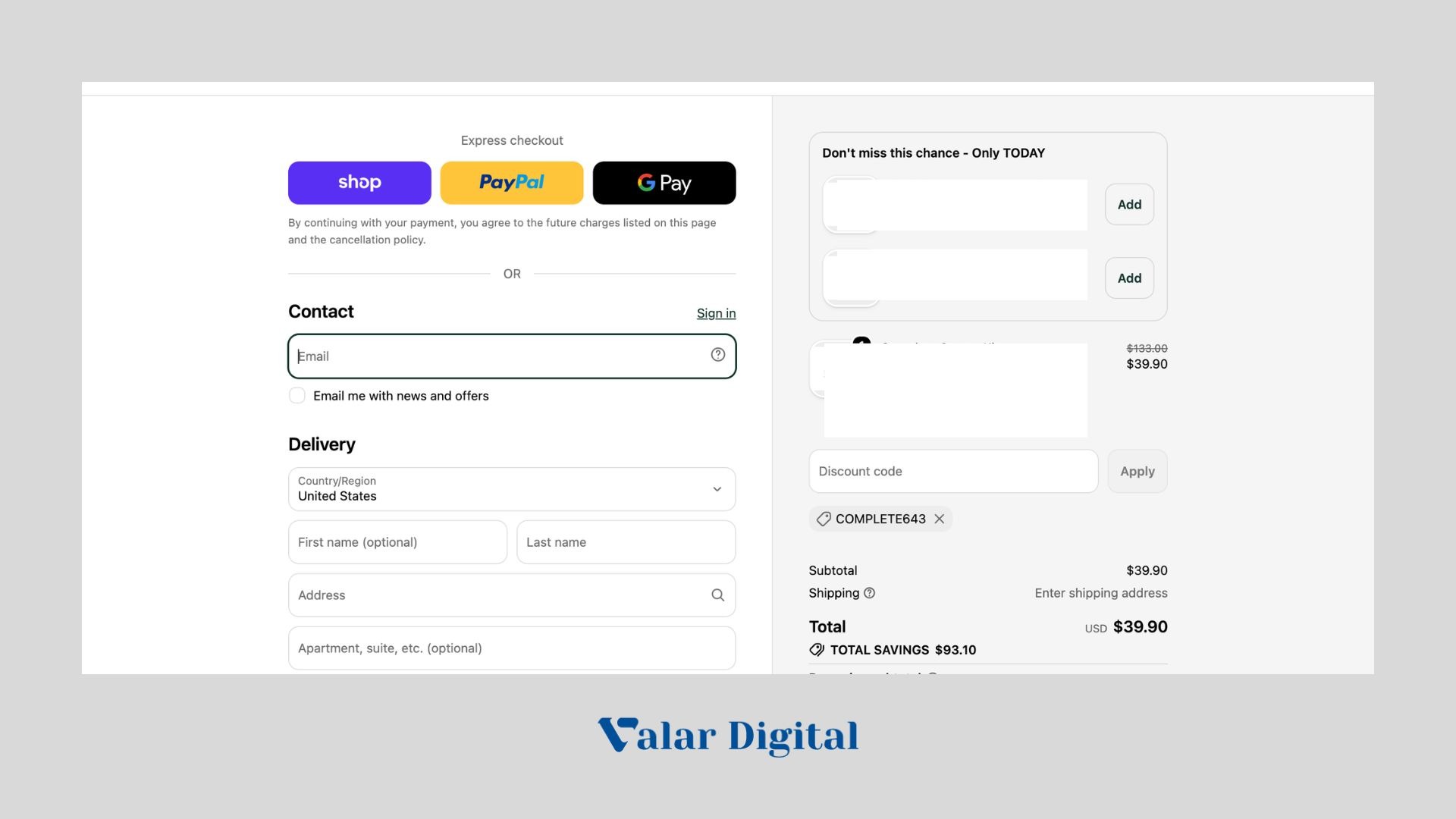
- Turn on guest checkout: Forcing account creation before purchase is mostly why shoppers abandon carts. Let people buy first and create an account later if they want.
- Add express payment options: Shop Pay, Apple Pay, Google Pay, and PayPal let returning customers check out in a single tap, without re-entering the address or card details.
- Show costs early and honestly: Unexpected price hikes through shipping fees or taxes at the final step are consistently the number one reason people abandon carts. Show an estimate on the product page or in the cart, before the surprise can happen at checkout.
- Cut every non-essential form field: Don’t ask for a company name or force a newsletter signup during checkout. Use address autofill wherever you can.
Make sure there are no surprises in the purchase funnel. Let the users discover your products and services through trust signals by reducing the hidden cost or extra step. Removing them is one less reason for someone to close the tab.
3. Go mobile-first, not just mobile-friendly
Roughly 70% of retail traffic now comes from phones, yet mobile conversion rates still tend to trail desktop traffic. That gap isn’t just a problem, but your biggest opportunity, since a modest improvement to mobile experience can make a huge difference to your traffic.
“Mobile-friendly” usually means your site won’t break when opened on a phone. Mobile-first defines your site to be primarily designed for phones:
- Put the essentials above the fold: Product name, image, price, and the “Add to Cart” button must all be visible without scrolling. If a shopper has to hunt for the buy button, you’re already lagging.
- Make buttons big enough to tap: Aim for at least 44×44 pixels, with enough space around them, and make the CTA text clearly visible in the button so shoppers can easily hit the right areas and land on the intended section.
- Keep text readable without zooming: A 16x base font size with generous line spacing will show a clear signal. Make sure the fonts are visible in the color contrast.
- Simplify forms and navigation: Collaps filters into dropdowns, use a slide-out menu, and cut any field that isn’t really necessary. Even the scroll is a friction on mobile, so use it strategically.
- Test on an actual phone: The theme editor preview isn’t the right place to look at. You have to QA where the users are landing and on which devices and browsers. Load your real site on a real device, and throttle your connection to see what shoppers see under slow network speeds.
Design with a thumb in mind, not a mouse. Serving a seamless mobile experience will fulfill the gap and leverage Shopify’s full potential.
4. Make product pages do the selling
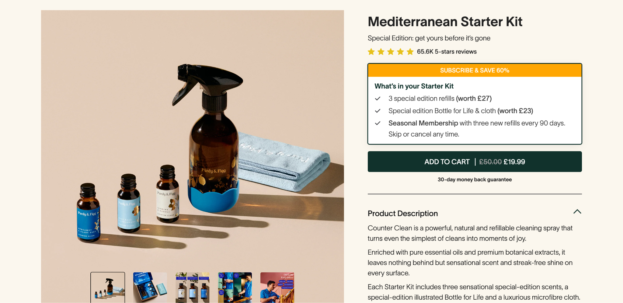
Your product page has to do the job a salesperson would do in a physical store. It should answer all the questions, clear doubts, build confidence, and make the product feel obvious. A few things that separate a page that sells from one that just displays products.
- Use real, varied images: Use multiple angles, lifestyle shots showing the product in use, and a short video if you can manage it. It reduces any hesitation and clears all doubts because it shows what the product is promised to do.
- Write for benefit, not for specs: “100% patented hair capsules” tells shoppers nothing about their issues. “40% less Hair Loss in 90 days Guaranteed” will tell them exactly why it matters.
- Answer objections before they’re asked: Shipping timelines, return policy, and warranty info should sit near the price and play button, and not be buried on a separate page. A lot of friction comes from shoppers not knowing what happens if the product doesn’t fit or arrives damaged.
- Make the CTA impossible to miss: High contrast, clear label, and no vague wording like “Know More” when you really mean to “Buy Now”.
A product page that clearly answers what the product is, how much it is, and what happens if I don’t use it, will consistently outperform one that just looks good.
5. Add social proof where it matters
Shoppers trust other shoppers more than they trust your copy. Most of the online buyers read reviews before purchasing, so hiding or skipping them will affect your direct revenue and conversions.
- Put reviews on the product page itself: You shouldn’t put them in separate tabs or sections. Star ratings and a couple of specific quotes near the price do more work than a generic “5 stars” badge.
- Use real customer photos and videos when you can: User-generated content tends to build more trust than any fancy studio shots. It’s real words coming from real people.
- Add trust badges near points of friction: A secure checkout icon with a “free returns” badge or “24/7” support near the size selector will dramatically help reduce hesitation at the same moment it shows up.
- Place proof next to the objection it answers: If shipping costs are a sticking point, make sure to include a rating or review count right next to that line. If price is the primary friction, put a testimonial near the buy button.
These social proofs are a functional part of the page, and they should direct users to the next action in the funnel. It works best when positioned exactly where the doubts creep in.
Where DTC Brands Actually Lose Conversions
The fixes above cover the front end of the funnel. But a staggering amount of revenue leaks out after the sale is technically won or gets lost to the issues that have nothing to do with your page’s design at all.
The post-purchase page is your most wasted real estate
A customer has bought something. They trust you more at this exact moment than at almost any other point in their relationship with your brand. But when at this point, most stores respond generically with the “Thanks for your order” page, and that’s it.
That’s a missed opportunity in every way because the customer has already entered their payment details. A one-click upsell at this stage doesn’t require any extra login or re-entry; just a single tap to add another item to the order that’s already getting purchased.
If done well, these offers can convert somewhere in the 5-15% range, and stores that use them regularly will see their average order value climb by 10-25%. That’s revenue on traffic you’ve already paid to acquire without risking your original sale, since the upsale offer appears after checkout is complete.
This is exactly where Upsell Master helps you close it. It adds one-click upsell and cross-sell offers to the post-purchase and in-checkout moments without any extra forms or re-entering your card details. Just a button that adds another item to the order. If you want one of the fastest wins available, this post-purchase strategy is all you need right now.
CRO isn’t just a/b testing button colors
A lot of teams treat CRO as “run some A/B tests and see what wins.” But that’s backward. Strategic CRO starts with a diagnosis, and not experimentation:
- Look at the data before you touch anything: Funnel reports, heatmaps, and session recordings will give you exactly where people are dropping off. The analysis will show you whether your funnel is leaking at Mobile PDPs, Cart page, checkout, or your selling campaigns.
- Test one variable at a time: If you change five things at once and conversion goes up, you won’t know which change actually mattered.
- Wait for statistical significance: A test that “wins” after 40 visitors isn’t a real result, but noise. Most teams wait for around 95% confidence before concluding a test. That’s the right way of doing it.
- Document that losses, not just the wins: A test that shows no difference isn’t wasted. It actually rules out your pre-test hypotheses and stops you from testing the same idea twice in the next one.
- Keep going: Once a test wins, roll it out and move on to the next significant problem. Small, compounding wins add up over months in a way that one big redesign rarely matches.
This paradigm shift is all you need while testing. One should find leaks before testing on gut feelings. Testing without diagnosis is just guessing with extra steps.
Technical debt is a silent conversion killer
This is the most straightforward CRO advice that most people entirely skip. Gradually, every Shopify store accumulates small technical issues that quietly creep across everything that any one-time front-end fix can accomplish:
- Leftover theme code: If you’ve switched themes or customized heavily over the years, old CSS and JavaScript can linger and show pages down under everyone’s nose.
- App conflicts: Apps you installed and forgot about often keep injecting scripts on every page load. Enough of these stacked on top of each other can severely affect page loading to make it feel sluggish or behave unpredictably.
- Broken or duplicate tracking: Old apps sometimes leave behind duplicate pixels or conflicting data layers that change how the data is parsed in GA4 and Shopify analytics. If the numbers on these platforms don’t agree with each other, you can’t really trust the data you’re making your decisions on.
- Mobile-specific glitches: Technical debt tends to show up on phones first. A pop-up covering the buy button, or a broken product gallery swipe. It’s easy to blame a “bad copy” for a problem that’s really a script conflict in the code.
A Simple Shopify CRO Process You Can Actually Follow
Here’s a five-step loop that works whether you’re a solo store owner or an agency running CRO for a client:
- Audit: Use Shopify or GA4 funnel reports to find where visitors are actually dropping off the most. Add heatmaps or session recordings on your highest-traffic pages to see what’s actually happening – where people click the most, scroll, and give up.
- Prioritize: Fix the highest-traffic, highest-drop-off pages first. A polished redesign of a rarely-visited collection page won’t move the goal post if main product pages or checkout are bleeding your sales.
- Test: Form a clear hypothesis before each test, for instance, “If we show shipping cost earlier, fewer people will abandon cart,” and change only that one thing, and conclude the results. Testing multiple things at once won’t give you clear answers to why and what worked.
- Implement: Roll out winners across the site. If a test fails, write down what you learned and move to the next hypothesis. Either outcome takes you forward towards the best store performance.
- Repeat: CRO doesn’t have an end date. New products, new traffic sources, and seasonal shifts all change what’s working and what’s not. Keep cycling through the loop and document every test correctly to avoid unnecessary retests.
Where to Go From Here
CRO isn’t a checklist you run once and forget. It’s an ongoing process you must build through discipline of removing friction, building trust, and making small improvements that add up to your store’s performance. Every visitor you’ve paid to bring to your site is at risk of leaving if they don’t buy. CRO is simply how you keep more of that traffic from walking out the door without purchasing anything.
Most generic Shopify CRO advice stops at “speed up your site and add reviews.” At Valar Digital, our team of experts takes this further by doing full-funnel audits, fixing the technical debt that’s quietly capping your performance, and building and testing the changes that actually move the revenue. In one recent DTC project, this approach doubled a client’s Shopify conversion rate, from 2.5% to 5% by cleaning up analytics, redesigning key pages, and optimizing the checkout window till post-purchase flows.
If your biggest untapped opportunity is specifically post-purchase revenue, our Shopify app Upsell Master adds a frictionless one-click upsell and cross-sell offers right after checkout, and even in the cart. Customer adds complementary products without re-entering any payment info or steps. Just one click and more revenue per order!
Ready to stop leaving sales on the table? Book your free CRO audit with us to boost your Shopify store conversions.
FAQs
What is conversion rate optimization?
Conversion rate optimization is the process of increasing the percentage of visitors who take a desired action on your store. For instance, it’s a process of making the most of the users to complete a purchase when they land on your store by combining data analysis to find where people are dropping off, with testing and fixing the issue to move that percentage up over time.
What is a good Shopify conversion rate?
Shopify store averages around 1.4-1.6%, depending on the type of market you’re in. Hitting 2.5-3% or higher is generally considered strong, and stores that sit above this are roughly in the top 20%.
How do I increase my conversion rate on Shopify?
By focusing on the highest-leverage areas first: page speed, checkout friction, mobile experience, and trust signals.
You can leverage it by compressing images and cutting bloated apps, enabling express payments, and showing costs upfront without any hidden surprises. You can use your post-purchase full potential through upsell, and run everything through a structured test-and-learn process instead of gut feelings.
Why is my Shopify conversion rate low, even with good traffic?
This usually means there’s an intent mismatch between what your traffic expects and what your site delivers. That could be unqualified traffic from broad ad targeting, or just a wrong URL redirect.
Does a Shopify theme affect conversion rate?
Yes, themes can indirectly affect your conversion rates. While all Shopify themes are responsive, only some of them are better optimized for your store. A modern theme helps, but an actual work is needed to use their full potential.
How long does Shopify CRO take to show results?
It depends on what you’re fixing. Quick wins like enabling Shop Pay or compressing images can show results within days. A/B tests typically take at least 14 days to reach statistical significance.